Milking the Right Brains
As Daniel Pink, author of “A Whole New Mind: Why Right Brainers Will Rule the Future” puts it, the time of left brain thinkers is over. This era is about Right Brain Thinking.
Is right brain thinking merely about crazy ideas, innovations and light bulbs? Most organizations put a bulk of the white collar employees through some kind of creativity or even innovation skill building workshops. Have you ever wondered what will happen if all your employees come up with new and newer ideas every day? How many new products, features and processes are you going to churn out in a year?
The answer lies in understanding how channelize right brain thinking and put it to use in daily work management. Visualization or Visual Analysis is a good avenue to utilize the right brain power of your employees. All of us have to analyze something or the other all the time. We constantly demand our team members to look at data or facts and take decisions, sometimes small and other times really big ones.
Visual Analysis is real fun, so employees who enjoy them and decision making will be simpler and faster, so businesses will benefit as well.
To understand where & how visual analysis can be used in daily management, lets take an a simple example and build over it.
Check out the below image:
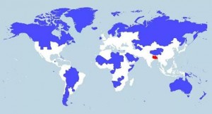
The area colored red in South Asia shows the geographical spread where 5% of the world population resides. The area colored in blue shows where another 5% resides.
The white areas show the geographical spread where remaining 90% of the world population resides. (Source : Avinash Kaushik, Author, Web Analytics 2.0 & Web Analytics : An Hour A Day)
This visual representation of data triggers you to think about how population density has impacted the economic development, resource scarcity, literacy levels, climatic conditions, military activities, etc.
This is a simple example of Choropleth Map, a type of Heat Map.
Heat Maps are graphical representation of data where the individual values contained in a matrix or picture is represented as colors. Choropleth Map is a thematic application of Heat Maps in which areas are shaded or patterned in proportion to the data being displayed on the map, such as population density or per-capita income.
The choropleth map provides an easy way to visualize how a measurement varies across a geographic area or it shows the level of variability within a region.
Color progression is used to demonstrate the difference between various groups. Either single hue progression or bi-polar color progression can be used. In the above example, latter has been used.
When using any of these methods there are two important principles: first is that darker colors are perceived as being higher in magnitude and second is that while there are millions of color variations the human eye is limited to how many colors it can easily distinguish. Generally five to seven color categories is recommended. The map user should be able to easily identify the implied magnitude of the hue and match it with the legend.
If you want to create a Choropleth Map, you can do that pretty fast with Google Sheets. Open your Google Drive, insert a new Google sheet, add graph and select ‘Geo Chart’.
Let’s now talk about some business applications of Heat Maps.
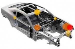
Here is a Heat Map showing the product failures during the reliability testing. The density of the problem is highlighted visually on the product frame rather than in a pareto diagram, bar chart or table. This helps us to understand problem prevalence and how it impacts occurrences of other failures.
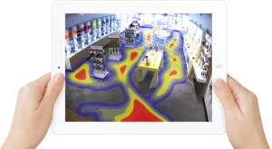
This example shows the heat map of floor pattern of customer paths and time spent in a retail store. Retail Analytics is catching up fast. Sam Walton, Walmart founder used these concepts several decades ago without any technology by creating mental maps to decide on merchandising.
![]()
Web Analytics is another area that companies are using to design the user interface. This illustration is about attention of gaze of the users. Baby’s face and the text nearby are drawing most of the attention. Originally, when the baby was facing the customers rather than the the text, heat maps showed that users where attracted to the baby face and not the adjacent text. (Source:Kissmetrics Blog)
Our brain has enormous capability to easily understand non-linear & multidimensional relationships and solve complex problems if we are willing to ‘visualize’! Visualization is not a pure art form. So one doesn’t need to be an artist, or be gifted. And neither does one need to glaze at a whiteboard in a silent room to visualize. There are proven tools with clear procedures that can be learnt and used to visually solve problems.
There are several simple yet non-math visual business analysis tools that can be applied in daily management to visually analyze, run the business and solve problems of varying complexity. Some of the tools include Journey Mapping, Text Mining, In-frame/Out-frame, Impact Wheel Analysis, Scatter Plots, Run Charts, Cause & Effect Diagram, Affinity Diagrams, Deployment Charts, Mind-maps, Histograms, Box-plots, etc.,
Here’s what you can do right away:
- Challenge your employees to solve problems visually
- Up skill them on Visual Analysis Tools
- Emphasize on the how they made decisions rather than the decisions itself